Humans learn best through stories. Some of the most memorable speeches and presentations start with a compelling story centered around people. Like John F. Kennedy’s iconic ‘we chose to go to the moon’ speech that begins with a tour of the progress of mankind.
Scientific studies now show that character-driven stories stimulate the production of oxytocin in our brains, which increases our willingness to help others and support a cause.

“This is literally how we have evolved to learn from each other. We must learn via story. We are not good at learning with other methods,” said Bill Shander, an information designer and professor within UVM’s Geographic Information Systems and Data Communication Professional Certificate Program.
Shander is on a mission to help people who work with data to communicate more effectively through storytelling. He recently hosted a free workshop, From Numbers to Narrative, to share four elements of effective data storytelling.
If you work with data and want to communicate more successfully, here’s what you need to consider.
Data Literacy and Analytics
According to Raul Bhargava and Catherine D’ignazio from MIT and Emerson College, data literacy is the ability to read, work with, analyze, and argue with data.
“There are levels of data literacy. It’s a spectrum,” Shander said. “Do you need to be a data scientist or a statistics Ph.D.? Of course not. But, you have to know some of it. And it’s not just about your data literacy, it’s about your audience. It’s more about them than anything else. How literate are they?”
Shander says only 24 percent of business decision-makers consider themselves data literate. This is where the importance of visualization comes in to help audiences easily make sense of data.
“Visualization is critical for you to uncover insights in your data and also for you to communicate those insights to an audience.”
Bill shander
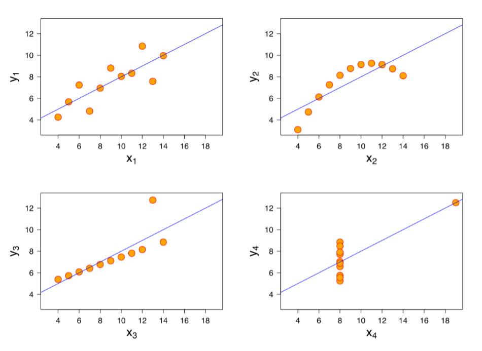
Anscombe’s Quartet is a classic example, Shander said. The four data sets (shown below) are statistically the same until they’re visualized in charts and are revealed to be wildly different.
In the workshop, Shander shares a series of questions you should ask yourself about your data to decide on the direction you’re going to take.
Good Storytelling with Bad Acronyms
With a good understanding of your data, the next step is to form the story. Shander created the self-proclaimed worst three acronyms to help people tell stories well with data. He calls them the KWYS (rhymes with why).
“If you understand these three things, the three legs of the stool, you’ll do a better job setting your priorities and focusing everything you’re doing for your audience,” Shander said.
- Know what you really want to say (KWYRWTS)
- Know what your data is saying (KWYDIS)
- Know what your audience needs to hear (KWYANTH)
“If you don’t understand your audience you can’t communicate with them. This is often something people skip. They don’t really think deeply about their audience. What do they know and what do they need to know? What do they expect? What might surprise them?” Shander said.
When you have those questions answered, Shander recommends outlining the sections in your story and checking for flow.
“Focus on the narrative and structure that will bring it together,” Shander said. “It’s about knowing what you’re trying to stay, adhering to the truth, and finding the narrative structure that will express it most effectively for your audience.”
Practice Design Thinking
Once you have your story in mind, you’ll need to think about how to best apply design to your data story.
Design thinking is a school of thought that prioritizes the audience’s needs first and occurs in five steps: empathy, define, ideate, prototype, and test.
“In data storytelling, we say here’s some data, crank out some charts, boom, done,” Shander said. “We don’t take the moment to step back and think strategically. This is where most of the failures occur… because we haven’t been empathetic with our audience, defined broadly what we’re trying to accomplish, ideated and prototype and tested.”
Use Design and Visualization Best Practices
There are a set of design best practices you can follow to bring design thinking to life. Your focus should be on creating an information hierarchy, or helping the audience quickly identify what’s most important. It’s about using the right type of chart and color usage, for example.
“Every human being experiences every visual experience pre-attentively. Meaning, before you’re paying attention to it, subconsciously,” Shander said, “because I know that…it changes how I design things.”
In the example below, Shander asks participants to quickly count the number of fours in the first image and then the second.


Just by increasing the contrast, the second image allows the audience to process the image much faster. Shander also recommends removing distractions and unnecessary elements in a chart.
“Do less. If you simply change your default behavior to minimize and simplify everything, you have a better chance of achieving your goal of helping your audience see the truth in your data.”
Before using design best practices:

After using design best practices:
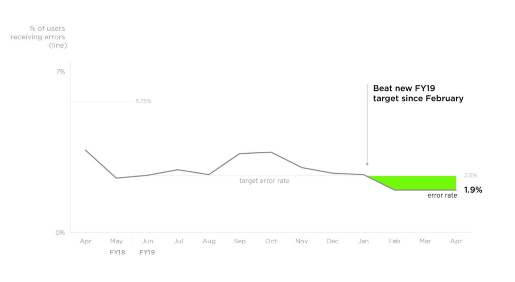
“Intentionality is the most important thing for this entire discussion. Intentionality around the data you pick, the analysis and how you do it, the questions you ask your data, all the way through to the storytelling and the visualizing, the chart selection, and design,” Shander said.” Intentionality is your friend. Do things for a reason and everything you do gets better.
Listen to the Numbers to Narrative info session for more tips on how to become a better data storyteller.
For more information about GIS and data communication as a career visit our GIS certificate program page.

